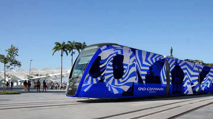
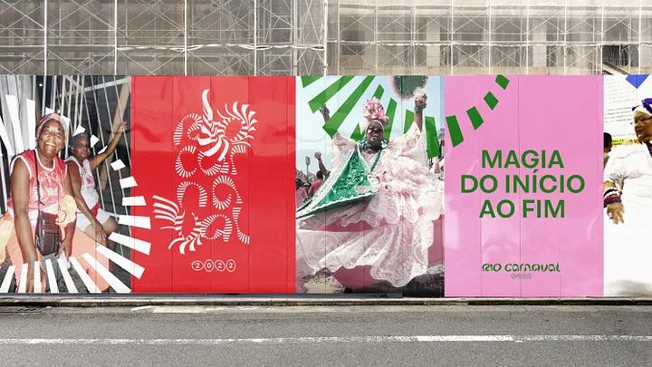
‘Rio Carnaval’: Yellow Pencil winner in Typography and Wood Pencil winner in Branding at D&AD Awards 2022
Por que as renovações de identidade de marca são como terapia (D&AD)
01.2025
Entrevista de Fred Gelli para o D&AD
Interview by Fred Gelli for D&AD
Texto em Português e Inglês | Text in Portuguese and English
[PT]
“Uma renovação de marca é como uma sessão de terapia”, diz Fred Gelli, cofundador e CEO da Tátil Design. “Você realmente precisa ir fundo e tentar se entender; só então será capaz de se expressar de uma forma diferente.”
Conversamos com Gelli, que será o presidente do júri da nova categoria Brand Identity Refresh no D&AD Awards 2025. A seguir, ele compartilha exemplos de estratégias implementadas em seu próprio trabalho, incluindo a reformulação da marca do Carnaval do Rio para criar uma identidade mais reconhecida globalmente.
Fale sobre a nova categoria Brand Identity Refresh do D&AD.
Este ano, tenho refletido sobre duas palavras: origem e originalidade, pois elas estão intimamente relacionadas. Para criar algo novo e autêntico ao mesmo tempo, é preciso que haja conexão com suas origens. Acredito que a ideia de uma renovação de identidade de marca esteja alinhada a essa perspectiva. Para que algo realmente pareça “renovado” para os outros, é fundamental permanecer ligado às raízes.
No branding, o foco está sempre mais na evolução do que na revolução. Valorizamos a originalidade e as ideias que rompem o ruído, mas uma renovação de marca é como uma sessão de terapia. Você realmente precisa se aprofundar e tentar se entender; só então conseguirá se expressar de outra maneira.
“Rio Carnaval”: vencedor do Yellow Pencil em Tipografia e vencedor do Wood Pencil em Branding no D&AD Awards 2022
Como você abordaria uma renovação de identidade de marca na Tátil Design?
Do meu ponto de vista, quando se trata de renovação de marca, o aspecto mais importante não é o design — é a estratégia. O design serve para apoiar e potencializar a estratégia. O momento certo para uma renovação de marca é quando uma organização está pronta para seguir em uma nova direção e adotar novas perspectivas.
Branding não é apenas função do departamento de marketing; é uma ferramenta estratégica que deve ser usada pelo CEO para alinhar toda a organização em direção a um objetivo comum. Com meus 35 anos de experiência, vejo como essa abordagem se tornou cada vez mais relevante.
Acredito que existam quatro dimensões-chave a considerar no branding. A primeira é a cultura — o seu pessoal. É impossível construir uma marca forte apenas com comunicação externa. Precisamos começar envolvendo nossa equipe para garantir que todos compreendam e estejam alinhados com as ideias centrais, os conceitos e a visão. É essencial que todos estejam remando na mesma direção.
A segunda dimensão são os seus produtos e serviços. Eles são as principais expressões da sua marca.
A terceira dimensão é a comunicação. Você está transmitindo de forma eficaz o que seus serviços são e quem você é?
Se as três primeiras dimensões estiverem bem definidas, a dimensão final surgirá naturalmente: o aspecto simbólico. É nesse ponto que se molda como a sua marca ocupa espaço na mente e no coração das pessoas.
“Rio Carnaval”: vencedor do Yellow Pencil em Tipografia e vencedor do Wood Pencil em Branding no D&AD Awards 2022
Dê um exemplo de uma grande renovação de identidade de marca.
Há alguns anos, realizamos um projeto complexo para a Petrobras, uma empresa brasileira de petróleo. Eles precisavam mudar sua identidade enquanto faziam a transição de uma companhia tradicional de petróleo para uma empresa de energia focada em fontes renováveis, como vento e solar. Mudar o nome de uma empresa é desafiador porque é essencial preservar sua essência, ao mesmo tempo em que se aponta para o futuro. A Petrobras é uma das marcas mais reconhecidas no Brasil, com seu logotipo presente em diversos postos de combustível. Nosso desafio era manter a forte conexão que as pessoas já tinham com a marca, mas também marcar o início de uma nova era. O nome que criamos foi “Vibra”, que remete à ideia de vibração, tanto do coração quanto de energia, e ainda mantém o “BR” do nome original, garantindo continuidade ao mesmo tempo em que sinaliza a transformação.
Também criamos uma identidade visual renovada para o Carnaval do Rio, para ajudar essa incrível expressão da identidade brasileira a se tornar mais global. Conduzimos mais de 7.000 entrevistas para entender o que usar como principal ícone, que acabou sendo a bandeira, por ser autêntica e embasada na comunidade do samba, mas também amplamente reconhecida.
[EN]
Why brand identity refreshes are like therapy (D&AD)
“A brand refresh is like a therapy session,” says Fred Gelli Gelli, co-founder and CEO of Tátil Design. “You really need to go deep and try and understand yourself; only then can you express yourself in a different way.”
We spoke with Gelli, who will lead D&AD’s new Brand Identity Refresh category as Jury President at the D&AD Awards 2025. Below, he shares examples of strategies he has implemented in his own work, including the rebranding of Rio Carnival to create a more globally recognisable identity.
Tell us about D&AD’s new Brand Identity Refresh award category?
“This year, I’ve been reflecting on two words: origin and originality, because they are closely related. To create something fresh yet authentic, it must be connected to your origins in some way. I believe that the idea of a brand identity refresh aligns with this perspective. To truly resonate as “refreshed” with others, it’s crucial to remain connected to your roots.
In branding, the focus is always more on evolution than revolution. We appreciate originality and ideas that break through the noise, but a brand refresh is like a therapy session. You really need to go deep and try and understand yourself; only then can you express yourself in a different way.
‘Rio Carnaval’: Yellow Pencil winner in Typography and Wood Pencil winner in Branding at D&AD Awards 2022
How would you approach a brand identity refresh at Tátil Design?
“From my perspective, when it comes to brand refreshes, the most important aspect isn’t the design — it’s the strategy. Design serves to support and enhance the strategy. The right moment for a brand refresh is when an organization is ready to move in a new direction and embrace new perspectives.
Branding is not just a function of the marketing department; it’s a strategic tool that should be utilised by the CEO to align the entire organisation toward a common goal. With my 35 years of experience, I’ve seen how this approach has become increasingly relevant.
I believe there are four key dimensions to consider in branding. The first is culture — your people. It’s impossible to build a strong brand solely through external communication. We need to start by engaging our team to ensure they understand and align with the core ideas, concepts, and vision. It’s essential that everyone is rowing in the same direction.
The second dimension is your products and services. These are the primary expressions of your brand.
The third dimension is communication. Are you effectively conveying what your services are and who you are?
If the first three dimensions are well-defined, the final dimension will naturally fall into place: the symbolic aspect. This involves shaping how your brand occupies space in the minds and hearts of people.
‘Rio Carnaval’: Yellow Pencil winner in Typography and Wood Pencil winner in Branding at D&AD Awards 2022
Give us an example of a great brand identity refresh?
“A few years ago, we undertook a complex project for Petrobras, a Brazilian petroleum company. They needed to change their identity as they transitioned from a traditional oil company to an energy company focused on renewable sources like wind and solar. Changing a company’s name is challenging because it’s essential to preserve its essence while also signalling its future direction. Petrobras is one of the most recognizable brands in Brazil, with its logo prominently displayed at many gas stations. Our challenge was to maintain the strong connection people had with the brand while also marking the beginning of a new era. The name we created was “Vibra,” which means “vibration” in Portuguese. This name not only connects to the vibrations of the heart and energy but also retains the “BR” from the original name, ensuring continuity while signalling their transformation.
We also created a refreshed visual identity for Rio Carnival, to help this amazing expression of Brazilian identity to become more global. We conducted more than 7,000 interviews to understand what to use as the main icon, which ended up being the flag, which felt authentic and informed by the Samba community but is also widely understood.
Ficha Técnica
Texto:
Fred Gelli
Comunicação&Mkt&Marca Tátil:
Luiza Magalhães, Marcelo Cândido e Natália Silveira
Assessoria:
Flávia Nakamura